I have promised not to serve on men-only panels.
Join me and dozens of others and sign the pledge at: http://www.owen.org/pledge
I have promised not to serve on men-only panels.
Join me and dozens of others and sign the pledge at: http://www.owen.org/pledge
An early morning at Two Jack Lake. Mt. Rundle was fully covered by the clouds earlier that morning and I was lucky some of them went away to allow me to see such a nice view. I was surrounded by wildlife but they were nice and quiet as I was minding my own business.
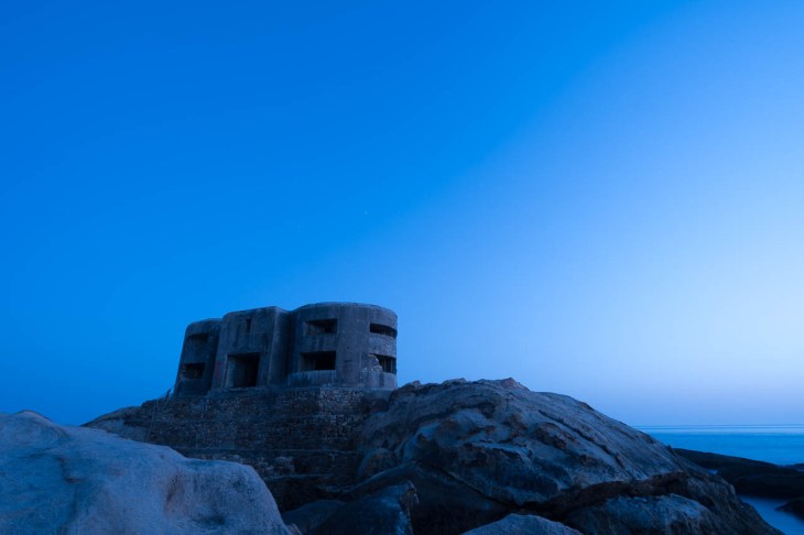
I had been to the area several times before. I had recently made my first attempt at a Milky Way shot at the near Valdevaqueros Dune. After reasonable success with that one, I decided to try another type of night shot and capture some star trails.
I arrived before sunset. This is a popular local spot for photography and, upon arrival, I already found a group of four photographers getting ready for some light painting. I set my tripod on top of the foreground rocks and started shooting right before sunset, then waited for the group to end and started to shoot the stars.
My plan was similar to last time: to get a tack sharp shot of the bunker in the blue hour and then take at least some 100 shoots of the stars at 20-30 seconds exposure time to then stack them in post to get the star trails. I ended up taking 150 shots.
I shot the stars at 20-second exposures using again the Sony PlayMemories timelapse camera app was. Learning from the previous shot, I didn’t touch the camera during the whole sequence and let the app do its thing.
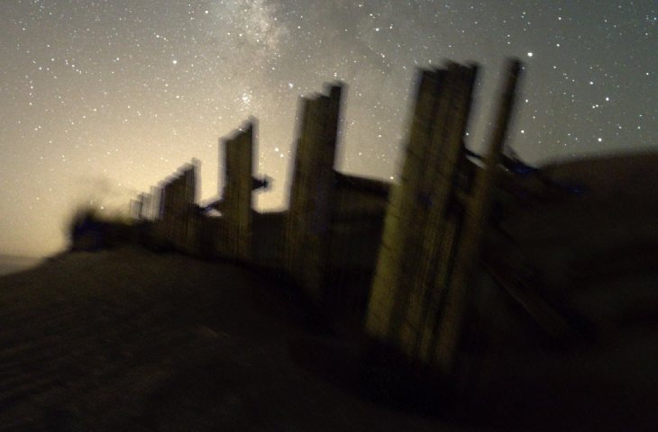
I searched for software to stack the star shots and get the trails and decided on the free StarStaX. Pretty easy to use. You only have to load the single images, pick a couple parameters and let it do its thing. The end result shows the star trails.
So you get from 150 frames like this:

to something like this (in this case using StarStaX’s gap filling method):

The rest of the processing was similar to the previous one, blending this blue hour shot in:
and correcting perspective, white balance, shadows, etc for the blend to be realistic.
The light pollution, this time coming from the nearby city of Tarifa, didn’t annoy me, and I even tried to embrace it.
In this occasion, I had learned the lesson and didn’t touch the camera, nor the tripod… nothing! And I set it up in a very quiet spot and protected it from the potential wind hence I avoided the issue with foreground alignment I had last time when doing the blend (phew!)
Valdevaqueros is a wonderful beach in the South of Spain, pretty well know to kite surfers. It has a quite high dune on the East end of the beach. The dune moves quite frequently and it’s not unusual to find important amounts of sand on the road next to the beach and diggers removing it to allow cars to pass.
To prevent the dune from collapsing, fences were put in various places in the middle of it, but the strong winds and the dune moves, make them fall and break very frequently and they are no longer replaced.
After a few years spending the summer holidays in the area, I decided I wanted to try something new and attempt my first serious shot of the Milky Way. I had read and watched several tutorials and felt myself prepared. My landscape lens is not that fast (f4) but the Sony A6300 is quite capable in low light so I was determined to try and not to go beyond 3,200 ISO anyway.
I arrived well before sunset to scout the area for one last time before the shot and find a spot good enough to keep some of the fences on the foreground and the Milky Way as the background showing above them. I set there with my beach chair, my sandwich and some water expecting to enjoy the landscape in silence and having it for myself.
It was less than week before the peak of the perseid meteor shower and I also expected to see some of those, too. And I did. Just a couple but stunning.
What I was not expecting, and was an interesting addition, was that a nearby bar had organized a live rock show and I was entertained for free for about two hours in almost total darkness by the distant Spanish rock music.
I started to shot before sunset. My plan was to get a tack sharp shot of the fences in the blue hour and then the Milky Way over them a couple hours later to later blend them both with the best of each.
I shot some 250 frames at 20-30 seconds every minute over about 5 hours. The Sony PlayMemories timelapse camera app was useful in this regard as it can automate this process as if it was an intervalometer. I was not that lazy so I was occasionally doing some manual adjustments from time to time with care not to move the camera.
I’m using Affinity Photo as of late for my most complex photo editing and processing and this was what I used to make the blend.
I started with the foreground blue hour shot. I tried to find the one that was sharp enough, and not too warm so it could be then realistically merged with the Milky Way background shot.

I then went through all the Milky Way shots until finding one where the Milky Way would be right above the fence and providing a pleasing composition.

I created separate layers and used luminosity masks to make the blend.
All right so far, uh? Nope. Error.
My tripod is too light, there was some wind and I was manipulating the camera at times. Result: the tripod moved between shots and the alignment of the fence in both shots was not working.
I had to spend a significant amount of time aligning both properly. Several hours. It was boring.
Lesson learned. Get a better tripod (I’ve just done it) and don’t mess around when the camera is taking long exposures.
Once that done I had to face an expected problem. The blue hour fence at f8 is much sharper than the Milky Way fence at f4, not to mention is much brighter. I created a mask around the fence mostly manually to then use a little bit of warp on the foreground to fill the gaps between the sharp and not so sharp fences. I hope it worked.
I was not annoyed by the light pollution. In case you wonder, the camera is facing the sea and beyond it, the African continent. The light comes from the city of Tangier, on the other side of the Strait of Gibraltar.
I’m pleased with the end result especially to be my first attempt.
Yosemite Falls is the highest waterfall in North America. Located in Yosemite National Park in the Sierra Nevada of California, it is a major attraction in the park, especially in late spring when the water flow is at its peak.
The total 2,425 feet (739 m) from the top of the upper fall to the base of the lower fall qualifies Yosemite Falls as the sixth highest waterfall in the world, though with the recent discovery of Gocta Cataracts, it appears on some lists as seventh.
Upper Yosemite Fall: The 1,430-foot (440 m) plunge alone is among the twenty highest waterfalls in the world. Trails from the valley floor and down from other park areas outside the valley lead to both the top and base of Upper Yosemite Fall. The upper fall is formed by the swift waters of Yosemite Creek, which, after meandering through Eagle Creek Meadow, hurl themselves over the edge of a hanging valley in a spectacular and deafening show of force.
http://en.wikipedia.org/wiki/Yosemite_Falls
As most of my landscape photo trips, I took advantage of a business trip to extend my stay and get to take some pictures. I traveled to San Jose in California where I rented a car and got to Yosemite National Park after a circa 4-hour drive. I spent only 3 days there, mainly visiting Yosemite Valley, staying at one of the hotels right outside the park’s entrance, only a 30-min drive from the center of the valley itself.
I came pretty prepared. Having seen Ansel Adam’s pictures and favorite locations many times, I got ahold of a key resource: Michael Frye’s «The Photographer’s Guide to Yosemite.» If you’re into photography and are going to Yosemite for the first time (or even if you’ve been there already, I’d say) you should get it. Maps, photo locations, tips, all is there, very well organized. Saved me lots of time, allowing me to be very effective and to make the most of my short stay.
It was May, so it was packed with tourists and the falls were at their best. In order to extend my days and get advantage of the best light, I decided not to sleep much, getting up at about 4am or earlier.
The morning I got the shot I left the hotel at about 4:30am and went straight to Cathedral Beach to get some shots of El Capitan hit by sunlight at its top. I then went to Swinging Bridge, where you can get the beautiful and quiet view of the Yosemite Falls reflected in the Merced river you can see here. It was really calm and the only other person I found at the location at such time (06:58am according to the EXIF data) was another photographer trying to get the shot, too.
It was hard to control the flare on the right hand side and I did my best to do so. I’m reasonably happy with how it turned out in this shot.
Although I bracketed as usual, no combination of the bracketed shows made me happy, so I only used one exposure on Lightroom. I applied the lens profile, opened up some shadows, decreased the highlights and increased clarity an vibrance. I also removed some spots from the river (leaves) to get a cleaner reflection effect.


